
People-centric means considering people’s needs and voices when designing, delivering, and evaluating policies and services.
In January 2021, I blogged on Teams’ immense development speed. I felt like a tiny Alice in a Microsoft Wonderland, curiously attempting to keep pace with the significant pipeline of new product features we could not even imagine.
I was right to feel curious about Teams as in March 2021, as the pandemic started, I blogged about Viva’s massive Microsoft Partner launch. An overwhelming bright-colored wrapper over a myriad of existing applications and 3rd party HR-related tools neatly accessed through the lens of Teams with “Employee Experience” and well-being front of mind.
I dug deeper into the Italian meaning of Viva, which means enjoy and celebrate! However, it was not coming across that way. Pleased to say the dust has settled, and the suite has grown from 4 to 9 ingenious and resourceful modules with more to follow.
The #VivaExplorers love this blog by Microsoft Design that tells the creative journey, and empathetic symbolism behind what has become a stunning brand for us to enjoy and features we predict, in time, be celebrated.
The Viva Suite touches upon human expressions with soft-edged iconography and soothing tones of teal and purple, emotionally connected to security, trust, and loyalty desired in a thriving hybrid workplace.
Designed on the Fluent UI System.
- The Viva Suite icon is a human shape representing a parent to all the modules, with a comforting blend of blue, teal, and purple.
- Viva Learning icon represents the turning of pages in a book with a growth mindset.
- Viva Connections icon forms an interlocking mark representing news, views, and resources reminiscent of a handshake.
- Viva Insights icon embodies the aspects of humans and knowledge and is supported by the two shapes at the bottom, forming a foundation and support mechanism.
- Viva Topics icon has three circles coming together, integrating diverse ideas to enable seamless collaboration.
- And now 5 more …

The Viva brand is gorgeous, and more importantly, the features are genuinely excellent but don’t expect to use everything! Select what is appropriate for you. Over the coming months and years, I imagine Viva will continue shapeshifting to support and empower a good employee experience and well-being, and so will the brand.
And just as managing a work-life balance is challenging, as is trying to keep up with the Fluent design elements. Don’t stress that you are not using the right icon in your slide deck; more importantly, try the helpful features at your fingertips and look forward to nurturing connections, enabling growth, discovering insights, having a purpose, and driving productivity.
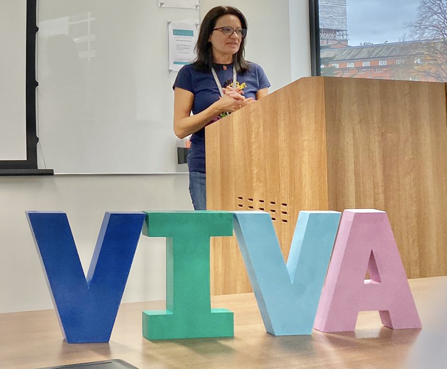
I made my own Viva sign for the #VivaExplorers first community event in the UK yesterday. The photo above is just some of the 60+ MVP friendly, welcoming and generous Viva Explorers and like-minded enthusiastic Viva friends the night before in my mind all icons and our camaraderie around Viva is priceless.
I bought 4 wooden letters that cost £7 each and spray-painted them with colours as close to the brand as possible. I would love to see more homemade examples. I imagine a photo of Viva spelled out made from people laying on the ground, demonstrating Viva is made up of people by people for an exceptional work-life balance.
Read the full Microsoft Design blog here The Iconography for Microsoft Viva.


Leave a comment